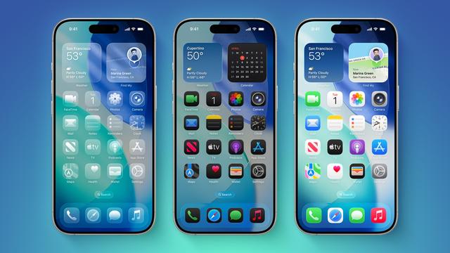
I'm a huge advocate for making apps accessible, but I find myself saying "fuck it" when dealing with Liquid Glass.
It's not possible to maintain contrast across a range of app content with a text label that's non-deterministic. When someone who's empathetic to the needs of others gives up, it's a huge loss.
Apple has a well earned reputation for accessibility and Alan Dye is fucking that up for a lot of folks who need affordances.
We should not be choosing between the lesser of two evils.
I'm a small indie dev, also having a full-time job. I'm trying my best to make great apps, but I simply cannot spend time fixing the issues a trillion dollar company creates.
This extends from accessibility to the general bugginess of the (UI) frameworks on the system these days. The majority of time I'm fighting the system instead of finishing the next great feature.
It's exhausting and there are times where I just stop working for weeks until some spark hits.
I don't really understand why people keep choosing things where major stuff changes on whims with little or no prior notice like this. Apple has been this way for a long time. They don't like to give users options either. My grandmother had enormous troubles when they changed to gesture-only interfacing for a lot of stuff. (Yes, even just unlocking the screen got a lot harder for her.)
And as much as I do advocate for the likes of LineageOS and etc on unlocked Android devices, I'll be the first in line to say that what the world is about ten years overdue for is a proper FLOSS full OS for these devices. Something where at least users can control what they use and select what works best for them. (Android/LineageOS gives us a lot of control, but the more the better.)
I assume/hope Apple will provide a “reduce Glassiness” option somewhere in the accessibility settings. I’ll be the first person to turn it on.
Edit: https://www.macrumors.com/2025/06/11/ios-26-liquid-glass-transparency/

MacRumors
Hate iOS 26's Liquid Glass Design? Here's How to Tone It DowniOS 26 features a whole new design material that Apple calls Liquid Glass, with a focus on transparency that lets the content on your display shine...
@mighty_orbot @chockenberry they already have Reduce Contrast. Edit: sorry, Reduce Transparency, but crucially Increase Contrast It works and is now much prettier than before.
That’s a pretty low bar though, because you need to and enough of the interface to get to that and the baseline is still pretty bad. Not as bad as the first images, but pretty bad.